Attachment
File/media card with upload states, three sizes, and horizontal or vertical orientations.
Examples
States
state drives the upload lifecycle: idle, uploading, processing, error, and done. The title shimmers while uploading or processing; error tints the media and description.
import {
  Attachment,
  AttachmentAction,
  AttachmentActions,
  AttachmentContent,
  AttachmentDescription,
  AttachmentMedia,
  AttachmentTitle,
} from "@codefast/ui/attachment";
import { Spinner } from "@codefast/ui/spinner";
import { CheckIcon, ClockIcon, FileTextIcon, FileWarningIcon, RefreshCwIcon, XIcon } from "lucide-react";

export function AttachmentStates() {
  return (
    <div className="flex w-full max-w-sm flex-col gap-2">
      <Attachment className="w-full" state="idle">
        <AttachmentMedia>
          <ClockIcon />
        </AttachmentMedia>
        <AttachmentContent>
          <AttachmentTitle>selected-file.pdf</AttachmentTitle>
          <AttachmentDescription>Ready to upload</AttachmentDescription>
        </AttachmentContent>
        <AttachmentActions>
          <AttachmentAction aria-label="Remove selected-file.pdf">
            <XIcon />
          </AttachmentAction>
        </AttachmentActions>
      </Attachment>
      <Attachment className="w-full" state="uploading">
        <AttachmentMedia>
          <Spinner />
        </AttachmentMedia>
        <AttachmentContent>
          <AttachmentTitle>design-system.zip</AttachmentTitle>
          <AttachmentDescription>Uploading · 64%</AttachmentDescription>
        </AttachmentContent>
        <AttachmentActions>
          <AttachmentAction aria-label="Cancel upload">
            <XIcon />
          </AttachmentAction>
        </AttachmentActions>
      </Attachment>
      <Attachment className="w-full" state="processing">
        <AttachmentMedia>
          <FileTextIcon />
        </AttachmentMedia>
        <AttachmentContent>
          <AttachmentTitle>market-research.pdf</AttachmentTitle>
          <AttachmentDescription>Processing document</AttachmentDescription>
        </AttachmentContent>
        <AttachmentActions>
          <AttachmentAction aria-label="Remove market-research.pdf">
            <XIcon />
          </AttachmentAction>
        </AttachmentActions>
      </Attachment>
      <Attachment className="w-full" state="error">
        <AttachmentMedia>
          <FileWarningIcon />
        </AttachmentMedia>
        <AttachmentContent>
          <AttachmentTitle>financial-model.xlsx</AttachmentTitle>
          <AttachmentDescription>Upload failed. Try again.</AttachmentDescription>
        </AttachmentContent>
        <AttachmentActions>
          <AttachmentAction aria-label="Retry upload">
            <RefreshCwIcon />
          </AttachmentAction>
          <AttachmentAction aria-label="Remove financial-model.xlsx">
            <XIcon />
          </AttachmentAction>
        </AttachmentActions>
      </Attachment>
      <Attachment className="w-full" state="done">
        <AttachmentMedia>
          <CheckIcon />
        </AttachmentMedia>
        <AttachmentContent>
          <AttachmentTitle>uploaded-report.pdf</AttachmentTitle>
          <AttachmentDescription>Uploaded · 1.8 MB</AttachmentDescription>
        </AttachmentContent>
        <AttachmentActions>
          <AttachmentAction aria-label="Remove uploaded-report.pdf">
            <XIcon />
          </AttachmentAction>
        </AttachmentActions>
      </Attachment>
    </div>
  );
}
Sizes
Three sizes — default, sm, and xs — scale the media, padding, and text together.
import {
  Attachment,
  AttachmentContent,
  AttachmentDescription,
  AttachmentMedia,
  AttachmentTitle,
} from "@codefast/ui/attachment";
import { FileTextIcon } from "lucide-react";

export function AttachmentSizes() {
  return (
    <div className="flex w-full max-w-sm flex-col gap-3">
      <Attachment className="w-full" size="default">
        <AttachmentMedia>
          <FileTextIcon />
        </AttachmentMedia>
        <AttachmentContent>
          <AttachmentTitle>Default attachment</AttachmentTitle>
          <AttachmentDescription>PDF · 2.4 MB</AttachmentDescription>
        </AttachmentContent>
      </Attachment>
      <Attachment className="w-full" size="sm">
        <AttachmentMedia>
          <FileTextIcon />
        </AttachmentMedia>
        <AttachmentContent>
          <AttachmentTitle>Small attachment</AttachmentTitle>
          <AttachmentDescription>PDF · 2.4 MB</AttachmentDescription>
        </AttachmentContent>
      </Attachment>
      <Attachment className="w-full" size="xs">
        <AttachmentMedia>
          <FileTextIcon />
        </AttachmentMedia>
        <AttachmentContent>
          <AttachmentTitle>Extra small attachment</AttachmentTitle>
        </AttachmentContent>
      </Attachment>
    </div>
  );
}
Orientation
horizontal is a compact row; vertical is a tile with the media on top and actions floated to the corner.

import {
  Attachment,
  AttachmentAction,
  AttachmentActions,
  AttachmentContent,
  AttachmentDescription,
  AttachmentMedia,
  AttachmentTitle,
} from "@codefast/ui/attachment";
import { Image } from "@unpic/react";
import { FileTextIcon, XIcon } from "lucide-react";

export function AttachmentOrientation() {
  return (
    <div className="flex flex-wrap items-start gap-4">
      <Attachment className="w-64" orientation="horizontal">
        <AttachmentMedia>
          <FileTextIcon />
        </AttachmentMedia>
        <AttachmentContent>
          <AttachmentTitle>quarterly-report.pdf</AttachmentTitle>
          <AttachmentDescription>Horizontal · PDF · 2.4 MB</AttachmentDescription>
        </AttachmentContent>
        <AttachmentActions>
          <AttachmentAction aria-label="Remove quarterly-report.pdf">
            <XIcon />
          </AttachmentAction>
        </AttachmentActions>
      </Attachment>
      <Attachment orientation="vertical">
        <AttachmentMedia variant="image">
          <Image
            alt="Workspace cover"
            className="size-full object-cover"
            layout="fullWidth"
            src="https://images.unsplash.com/photo-1497366754035-f200968a6e72?w=600&auto=format&fit=crop&q=80"
          />
        </AttachmentMedia>
        <AttachmentContent>
          <AttachmentTitle>workspace.png</AttachmentTitle>
          <AttachmentDescription>Vertical · PNG</AttachmentDescription>
        </AttachmentContent>
        <AttachmentActions>
          <AttachmentAction aria-label="Remove workspace.png">
            <XIcon />
          </AttachmentAction>
        </AttachmentActions>
      </Attachment>
    </div>
  );
}
Group
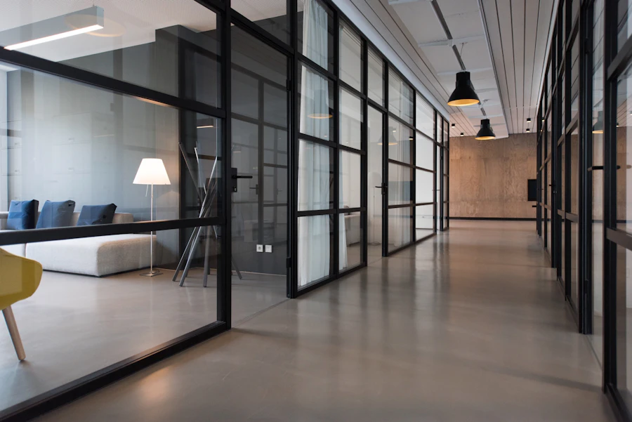
AttachmentGroup lays out a horizontally scrollable, snap-aligned row with a direction-aware edge fade. Mix icon and image media in the same row.
import {
  Attachment,
  AttachmentAction,
  AttachmentActions,
  AttachmentContent,
  AttachmentDescription,
  AttachmentGroup,
  AttachmentMedia,
  AttachmentTitle,
} from "@codefast/ui/attachment";
import { Image } from "@unpic/react";
import type { LucideIcon } from "lucide-react";
import { FileCodeIcon, FileTextIcon, TableIcon, XIcon } from "lucide-react";

interface Item {
  name: string;
  meta: string;
  icon?: LucideIcon | undefined;
  src?: string | undefined;
}

const items: Array<Item> = [
  { name: "briefing-notes.pdf", meta: "PDF · 1.4 MB", icon: FileTextIcon },
  {
    name: "workspace.png",
    meta: "PNG · 820 KB",
    src: "https://images.unsplash.com/photo-1497366754035-f200968a6e72?w=900&auto=format&fit=crop&q=80",
  },
  { name: "customers.csv", meta: "CSV · 18 KB", icon: TableIcon },
  { name: "renderer.tsx", meta: "TSX · 12 KB", icon: FileCodeIcon },
];

export function AttachmentGroupExample() {
  return (
    <AttachmentGroup className="w-full max-w-sm">
      {items.map((item) => {
        const Icon = item.icon;

        return (
          <Attachment key={item.name} className="w-64">
            {item.src ? (
              <AttachmentMedia variant="image">
                <Image alt={item.name} className="size-full object-cover" layout="fullWidth" src={item.src} />
              </AttachmentMedia>
            ) : Icon ? (
              <AttachmentMedia>
                <Icon />
              </AttachmentMedia>
            ) : null}
            <AttachmentContent>
              <AttachmentTitle>{item.name}</AttachmentTitle>
              <AttachmentDescription>{item.meta}</AttachmentDescription>
            </AttachmentContent>
            <AttachmentActions>
              <AttachmentAction aria-label={`Remove ${item.name}`}>
                <XIcon />
              </AttachmentAction>
            </AttachmentActions>
          </Attachment>
        );
      })}
    </AttachmentGroup>
  );
}
Image
A gallery of vertical image tiles inside AttachmentGroup, each wrapping a full-card AttachmentTrigger to open the media.


import {
  Attachment,
  AttachmentAction,
  AttachmentActions,
  AttachmentContent,
  AttachmentDescription,
  AttachmentGroup,
  AttachmentMedia,
  AttachmentTitle,
  AttachmentTrigger,
} from "@codefast/ui/attachment";
import { Image } from "@unpic/react";
import { XIcon } from "lucide-react";

const images = [
  {
    name: "workspace.png",
    meta: "PNG · 820 KB",
    src: "https://images.unsplash.com/photo-1497366754035-f200968a6e72?w=900&auto=format&fit=crop&q=80",
    alt: "Workspace",
  },
  {
    name: "desk-reference.jpg",
    meta: "JPG · 1.1 MB",
    src: "https://images.unsplash.com/photo-1497215728101-856f4ea42174?w=900&auto=format&fit=crop&q=80",
    alt: "Desk",
  },
  {
    name: "office-reference.jpg",
    meta: "JPG · 940 KB",
    src: "https://images.unsplash.com/photo-1497366811353-6870744d04b2?w=900&auto=format&fit=crop&q=80",
    alt: "Office",
  },
];

export function AttachmentImage() {
  return (
    <AttachmentGroup className="w-full max-w-sm">
      {images.map((image) => (
        <Attachment key={image.name} orientation="vertical">
          <AttachmentMedia variant="image">
            <Image alt={image.alt} className="size-full object-cover" layout="fullWidth" src={image.src} />
          </AttachmentMedia>
          <AttachmentContent>
            <AttachmentTitle>{image.name}</AttachmentTitle>
            <AttachmentDescription>{image.meta}</AttachmentDescription>
          </AttachmentContent>
          <AttachmentActions>
            <AttachmentAction aria-label={`Remove ${image.name}`}>
              <XIcon />
            </AttachmentAction>
          </AttachmentActions>
          <AttachmentTrigger asChild>
            <button aria-label={`Open ${image.name}`} type="button" />
          </AttachmentTrigger>
        </Attachment>
      ))}
    </AttachmentGroup>
  );
}
Trigger
AttachmentTrigger fills the card as a single click target (open/preview) while AttachmentActions stay clickable above it.
import {
  Attachment,
  AttachmentAction,
  AttachmentActions,
  AttachmentContent,
  AttachmentDescription,
  AttachmentMedia,
  AttachmentTitle,
  AttachmentTrigger,
} from "@codefast/ui/attachment";
import {
  Dialog,
  DialogContent,
  DialogDescription,
  DialogHeader,
  DialogTitle,
  DialogTrigger,
} from "@codefast/ui/dialog";
import { CopyIcon, FileSearchIcon, XIcon } from "lucide-react";

export function AttachmentTriggerExample() {
  return (
    <Dialog>
      <Attachment className="w-full max-w-sm">
        <AttachmentMedia>
          <FileSearchIcon />
        </AttachmentMedia>
        <AttachmentContent>
          <AttachmentTitle>research-summary.pdf</AttachmentTitle>
          <AttachmentDescription>Open preview dialog</AttachmentDescription>
        </AttachmentContent>
        <AttachmentActions>
          <AttachmentAction aria-label="Copy link">
            <CopyIcon />
          </AttachmentAction>
          <AttachmentAction aria-label="Remove research-summary.pdf">
            <XIcon />
          </AttachmentAction>
        </AttachmentActions>
        <DialogTrigger asChild>
          <AttachmentTrigger aria-label="Preview research-summary.pdf" />
        </DialogTrigger>
      </Attachment>
      <DialogContent className="sm:max-w-md">
        <DialogHeader>
          <DialogTitle>research-summary.pdf</DialogTitle>
          <DialogDescription>
            The attachment trigger fills the card and opens the dialog, while the actions stay independently clickable
            above it.
          </DialogDescription>
        </DialogHeader>
      </DialogContent>
    </Dialog>
  );
}
Usage
The minimal import and composition — see Examples below for styled, real-world variants.
import {
  Attachment,
  AttachmentAction,
  AttachmentActions,
  AttachmentContent,
  AttachmentDescription,
  AttachmentMedia,
  AttachmentTitle,
} from "@codefast/ui/attachment";
import { FileTextIcon, XIcon } from "lucide-react";

export function AttachmentUsage() {
  return (
    <Attachment>
      <AttachmentMedia>
        <FileTextIcon />
      </AttachmentMedia>
      <AttachmentContent>
        <AttachmentTitle>sales-dashboard.pdf</AttachmentTitle>
        <AttachmentDescription>PDF · 2.4 MB</AttachmentDescription>
      </AttachmentContent>
      <AttachmentActions>
        <AttachmentAction aria-label="Remove sales-dashboard.pdf">
          <XIcon />
        </AttachmentAction>
      </AttachmentActions>
    </Attachment>
  );
}
Anatomy
How the parts nest — every slot the component exposes, in composition order.
Features
- Icon and image media through AttachmentMedia.
- Upload states — idle, uploading, processing, error, done — with a built-in shimmer while in progress.
- Three sizes and horizontal or vertical orientation.
- A full-card AttachmentTrigger that stays independently clickable alongside AttachmentActions.
- Scrollable, snapping AttachmentGroup with a direction-aware edge fade.
API reference
Props for each part of the component. All native element props are also forwarded.
Attachment
The card. Exposes lifecycle and layout via data attributes its parts react to.
state"idle" | "uploading" | "processing" | "error" | "done"Upload lifecycle; drives shimmer, dashed border (idle), and destructive tint (error).
Default
"done"size"default" | "sm" | "xs"Overall density.
Default
"default"orientation"horizontal" | "vertical"Row layout or vertical tile.
Default
"horizontal"
AttachmentMedia
Thumbnail slot.
variant"icon" | "image"Icon tile, or a cover image that fills and crops.
Default
"icon"
AttachmentAction
An action button; defaults to a ghost icon button.
variantButtonProps['variant']Button variant.
Default
"ghost"sizeButtonProps['size']Button size.
Default
"icon-xs"
AttachmentTrigger
Full-card overlay trigger for opening or previewing the attachment.
asChildbooleanRender as the child element (e.g. a link); type defaults to 'button' otherwise.
Default
false
AttachmentContent
The text column wrapping the title and description.
childrenReactNodeAttachmentTitle and AttachmentDescription.
AttachmentTitle
The attachment's file name or label.
childrenReactNodeThe name or label text.
AttachmentDescription
The secondary line under the title.
childrenReactNodeFile size, status text, or similar.
AttachmentActions
The action button cluster.
childrenReactNodeOne or more AttachmentAction buttons.
AttachmentGroup
A horizontally scrollable, snap-aligned row wrapping multiple Attachment cards.
childrenReactNodeThe Attachment cards in the row.
Accessibility
Built to be keyboard-navigable and screen-reader friendly out of the box.
- Label icon-only actions: AttachmentAction is usually icon-only — give each one an aria-label naming its target.
- Label the trigger: AttachmentTrigger covers the card with no text of its own — give it an aria-label too.
- Keyboard scrolling: AttachmentGroup scrolls horizontally; interactive attachments stay reachable by tabbing.
- Meaning beyond color: Keep the failure reason in an AttachmentDescription — error isn't signaled by color alone.
Guidelines
Conventions that keep usage consistent across an app.
Do
- Show a Spinner in AttachmentMedia while state is uploading or processing.
- Use the vertical orientation for image-forward galleries and horizontal for file lists.
Don’t
- Don’t leave action buttons unlabeled.
- Don’t use the image variant without an actual image child.
Explore further
Ready to integrate?
Follow the Getting Started guide to install @codefast/ui, or browse the full component gallery.